Sunday, 12 June 2011

Holes


This project was a learning experience. I think the main things I learnt were not to choose reference images with too much pattern detail if I wasn't going to draw the patterns, and to avoid drawing fine details from a poor quality reference.


As usual I started with the easy grid method. I also combined two images to complete the top of the upper figures head and legs.


Following the first stage I wasn't sure about some of the line work so I started with the face as I expected it to be the most difficult and telling if it was going badly.


The first face seemed to go well, so I added the hair to frame the face.

Then I added the end of the top models legs and her top. With the top I dropped all the pattern details as they did not allow for much tonal variation. I think as a result the tone of the top came out a bit light for the image.


Then carrying on with the detail I added the gloves, shorts and fingers. This was a dense area of detail and by the end I was again not sure that too much detail had been lost from the reference.


Then to finish the top model, the rest of the skin tones were added.


The foreground figure was added starting from the edges where the two figures overlapped. The dark glove in the foreground needed some adjustment to as not to become a continuation of the line of the first figures leg.

 Some of the dark tones were enhanced with the Prismacolor non-erasable black pencil, which was a good thing to learn, and also I darkened the tones overall.

Tuesday, 7 June 2011

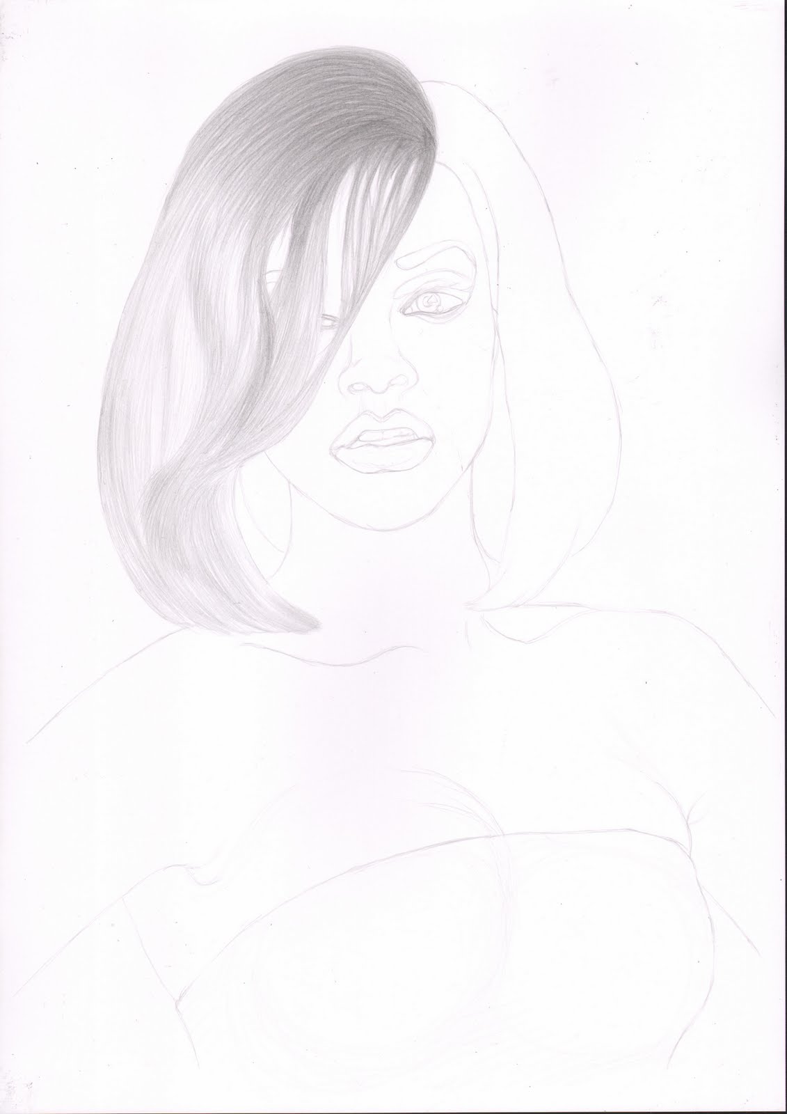
Rihanna

What's her name ...


Well you have to do at least one famous person some time. Now I look at this scan I probably should have cleaned the scanner glass a bit first!


Well I started this one with the easy grid method as you can see.


Then I started with the dark areas of the hair on one side.


I then carried on to darken the hair. This was quite difficult as her hair was colored and straightened, which meant it didn't flow very well and had a strange texture.


Once the hair on the left was done, it was easier to match the other side, which was also less complex.


With the addition of the eyes, the portrait started to come together. The make-up here was quite stylised and pronounced which was fun to draw.


I enjoy drawing the lips as you can really go for the shine without the extra detail that is needed for the eyes.


Next I started to add tone to the nose, but this naturally lead to shading the rest of the face, so I just went with the flow on this.


I started next on the body and shade round the lower jaw. As I wanted to keep this large area consistent I worked on it all at the same time, but started with the darkest areas.


Finally I added some clothes.

Saturday, 28 May 2011

Yokan


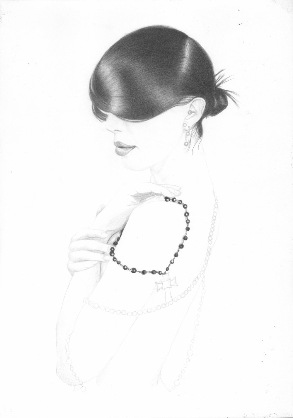
I had a beautiful reference to draw from here. I was first captivated by the hair style of the model in this pose, and the way her body shape was shown more through he flow of the beads on her skin. Sadly due to the very soft tones used in the drawing the image does not scan very well and I had to adjust the contrast quite a bit in the image here.


As usual I started with the easy grid method. This stage took quite a long time as I was distracted and there were a lot of bead details to get right.


The hair was built up with lots of long strokes over a few sessions, which I forgot to scan as I was enjoying the drawing too much.


The bun and loose hairs at the back helped to give some life to the hair style and framed the shape of the head.


From the back of the hair, the ear was the next natural area to tone in, and was the only area of mid tones on the head apart from the lips.


The nose had only some slight tone on the bottom to help give it some volume and then the full lips were filled in slowly going with the direction of the skin. I normally enjoy drawing lips and this was no exception. I kept coming  back to the lips during this project to add more tone in small areas.


Next I added all the light tones to the rest of the body. This allowed me to remove much of the original line work as I wanted only to have a very soft hint of the edges of the figure where needed.


The beads were added in stages, along with the soft shadows they cast when they came into contact with  the models skin.

The line of beads across the models back helps to show where here far shoulder is and hints at the curve or her back. The density of these beads seems to be due to the way they are draped round.


The string of beads round the back of the model was out of focus in the reference image and so was rendered here with very little highlights. The beads from the crook of her left arm however were given highlights and the darker shadow they cast on her arm.


Then I went over the whole image to adjust the contrast while trying to keep the over exposed light of her skin.

As you can see from this scan the soft tones were not picked up well by the scanner and were still hard to see even after normal contract adjustments for the scan. But I am very please with the final original image.

Monday, 16 May 2011

Desk Job

Working late again...


This was a simple image but enjoyable to draw. With col-erase on Bristol board.


As normal I started with the easy grid method.


As most of the detail is in the face and the pulled skin was difficult to draw I started there.


To frame the body and to work on some of the darker edge tones I added the top arm with the binding. This top arm also had some of the lightest spots.


The rest of the upper body formed a natural group, shaped by large areas of tone.


Next I added the hair to frame the face and the large tonal area of the foreground leg. These two stages were added when I was unable to make individual scans.


The second leg and finger tips then helped to frame the figure, though at this stage the tone was still a bit light.


The figure was finished with the tool and the desktop was added. Pencil shading for the desk was kept in line with the wood grain and the shape was built up with lengths of tone.


Working over the whole image and concentrating on the desk, darker tones were added.


Finally some light tone was added below the desk. I was planning on making the background dark, but as the figure is light I didn't want to push it into the background.

Friday, 29 April 2011

Hook

She's hooked.


This was another col-erase on on Bristol board project, this time with plenty of loose cross hatching. This turned out to be quite a difficult project.

As before I started this using the easy grid method.

I then started to add the background. This was in order to outline the figure as the centre of the image would be light with mid tones I wanted to make sure I didn't need to add dark lines later.


As the main figure has light hair I put that in next. Here I was aiming to draw the space between the hairs and keep it light where it wasn't in shade.

I then added the top hand as it had some dark contrast tones and helped to provide a boundary for the hair.

Then to balance the first hand and to add a context for the chain I started adding tone to the second hand.

Once the second hand was in place I added the black strap, again to provide contrast. I have also darkened some more of the background.

Then to complete the first pass of the hands I added tone to the chain. I preserved a lot of white here which was covered later.

The hook sets the centre focus of this image. I moved on to the hook, keeping light areas for the highlights.


Once the hook was in place I added the mid tones to the legs and shadow areas on the bed.

Then to finish I passed over the whole image a number of times deepening the darker tones and defining the boundaries more without using hard lines.