Monday, 24 October 2011

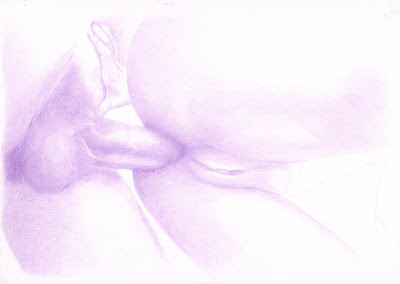
Bubble II

..after the spank


Another adventure with the watercolour pencils and a light touch :)


As usual I started with the easy grid method and a purple pencil.


I took a first pass over the line work to add tone with the purple pencil.


Taking notice of the darkest areas of the image I worked over it again and this time added tone to the rolled knickers.


To start moving the colour closer to a skin tone, I added brown over all the skin areas.


Finally I used  pink to finish the knickers. Also the dark tones were created with a mix of dark blue and dark brown. Then going over the red areas with a pink/red tone.

Monday, 17 October 2011

Bubble

A bum study in black and white.


Back to the col-erase.


This image started with the easy grid method.


The head and face were the most complex part of this image and didn't look so good after the line stage, so I started working there to address any problems early, but I was surprised that it came together well.


I then worked back from the darker tones of the head and neck to the lighter tones along the shoulder and arm.

The tones round the hand helped to give shape and focus to the centre of the image.


To finish this image I worked on the turning planes of the legs and balanced the tones across the image.

Tuesday, 11 October 2011

Trap II

Not the natural tones :)


An experiment using colours from a different pallet to the reference. This was an interesting picture to was as it seemed to change quite a bit during the process.


Started with the easy grid method again, with a hard to see scan :)


Working with my base blue colour I stared to work on the light and dark tones.


I ended up adding more monochrome tones than I had intended to do to start with as I got carried away with the image :)


Then I added the reflections on the hard bracelet.


Things started to change a bit when I then added the yellow layer. I was trying to drop this in for the light tones, which was difficult as I normally work dark to light, to this was a challenge and probably something I was working to fix for the rest of the image.


The purple/pink colour that went on next really helped to smooth in the mid tones and add some warmth. This did seem to work well with the previous yellow layer.


Finally I needed to use black for the dark tones at the pencil set wasn't giving any more depth from the other colours, and it gave the cloth a neutral contrast to the skin. 

Tuesday, 4 October 2011

Shoot for the Star

Shooting for the star! 


My largest colour drawing to date. I think the limited colours in this project helped to keep the warm feeling. When I started this image I just wanted to draw something a bit less subtle.

I really enjoyed seeing the various layers of this image being built up during the process and how they worked together when laid down. All using water colour pencils.


As usual I started with the easy grid method but put the lines in with  dark purple water colour pencil.


As I have found with these watercolour pencils generally, the base tone layer was laid down pretty quickly.


Then the tones for the background and arm on the far right were added. I took a detailed scan of the image at this stage as I liked the monochrome look.


Starting with the male figure first I added a light brown town layer working with the purple base tones.


Then over the top of the light brown tones I added  a dark brown and then some black for the really dark tones. At this stage I also used black to tone areas of the skin that had little colour and looked slightly grey in minimal light.


To bridge the tones between the two figures I next worked on the female hand, which also provided contrast for the top visible part of the male torso. 


The light and dark brown tone layers were then added to the female figure while leaving the light skin tones in place. The dark tones were then augmented with a little black and blended in.

Then I started with the orange background. The background was added as a consistent thick layer.


The background was faded out at the edges but a consistent coverage was maintained. This was mainly due to the orange pencil being quite soft.


Finally shape was added to the background cloth with a mix of a light brown and the knead-able eraser.