Tuesday 20 December 2011

Scoop

Scoop it up and dig dig dig it...


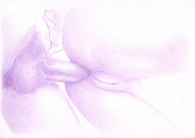
This image was drawn with the col-erase pencil again and was a pleasure to draw. I enjoyed building up the layers of tone and working with the background.


As usual I started with the easy grid method.


The blocks of tone were started with the background gradient to provide a tone to render into. The background was also added early to avoid having to fill in tone with pencil strokes that emphasises the shape of the negative space.


The tone of the bodies was started with the male figure as he contained the darkest tones. Also as the background tones were darker on the right I decided to work right to left on this image.


The male arm in the foreground provided a key reference point as it was central to the image and had some deep dark tones.


The tones of the female bum were added next as they were cast by the male figure and worked with the the shadows cast by his body.


Working in blocks of tone I then added the tone for the bent female legs and the darker tones of the tummy and breasts before continuing the light tones across the rest of the skin.


Next I added the darker tones of the face, eyelashes and lips. This helped to define the shape of the face and prepared the background for the addition of hair.


The hair was added with light tones initially to provide a guide as to the shape and tone of the final hair position and to help work out the lines of the neck muscles.


Finally I worked over the whole image darkening tones and solidifying edges and boundaries.

Saturday 26 November 2011

Spit and Polish

Make it shine!


This image was drawn from one of our holiday snaps. Using Windsor & Newton Bristol board which I find is very smooth, and WHSmiths watercolour pencils.


As usual I started off with the easy grid method. I draw this dark and then took most of the pencil off after the scan, but before I started blocking in.


The hat was the first stage and I wanted to use this opportunity to see how the black colour worked on it's own for drawing. I was pleased with the range of tone available.


After blocking in the tones I then tested the pencil further to see if some sharper constrast could be produced, as the pencils are quite soft, and was very pleased with the results.


Next I moved on to adding some dark colour tones in the hair. The darker tones were easier to work with as they could be covered over with thicker layers if they needed to be changed. After the hair I moved on the contracting lighter skin tones, but again started with the darker blush and shadow areas.


Working up slowly I added more skin tones but kept a strong contract with the blacks. The pale skin tones looked very washed out at this stage until the glasses were added with helped to add depth and frame the face.


The dark top was added in the lower right corner to mark the contract range of tones that would be used across in the final image.


Then building up the tones of the jacket, I found a blending stump was really useful as new layers were added to keep a smoother finish.


Once all the tone areas were blocked in and the last details added, I went back over the whole image enhancing the darker tones where needed.

Monday 24 October 2011

Bubble II

..after the spank


Another adventure with the watercolour pencils and a light touch :)


As usual I started with the easy grid method and a purple pencil.


I took a first pass over the line work to add tone with the purple pencil.


Taking notice of the darkest areas of the image I worked over it again and this time added tone to the rolled knickers.


To start moving the colour closer to a skin tone, I added brown over all the skin areas.


Finally I used  pink to finish the knickers. Also the dark tones were created with a mix of dark blue and dark brown. Then going over the red areas with a pink/red tone.

Monday 17 October 2011

Bubble

A bum study in black and white.


Back to the col-erase.


This image started with the easy grid method.


The head and face were the most complex part of this image and didn't look so good after the line stage, so I started working there to address any problems early, but I was surprised that it came together well.


I then worked back from the darker tones of the head and neck to the lighter tones along the shoulder and arm.

The tones round the hand helped to give shape and focus to the centre of the image.


To finish this image I worked on the turning planes of the legs and balanced the tones across the image.

Tuesday 11 October 2011

Trap II

Not the natural tones :)


An experiment using colours from a different pallet to the reference. This was an interesting picture to was as it seemed to change quite a bit during the process.


Started with the easy grid method again, with a hard to see scan :)


Working with my base blue colour I stared to work on the light and dark tones.


I ended up adding more monochrome tones than I had intended to do to start with as I got carried away with the image :)


Then I added the reflections on the hard bracelet.


Things started to change a bit when I then added the yellow layer. I was trying to drop this in for the light tones, which was difficult as I normally work dark to light, to this was a challenge and probably something I was working to fix for the rest of the image.


The purple/pink colour that went on next really helped to smooth in the mid tones and add some warmth. This did seem to work well with the previous yellow layer.


Finally I needed to use black for the dark tones at the pencil set wasn't giving any more depth from the other colours, and it gave the cloth a neutral contrast to the skin. 

Tuesday 4 October 2011

Shoot for the Star

Shooting for the star! 


My largest colour drawing to date. I think the limited colours in this project helped to keep the warm feeling. When I started this image I just wanted to draw something a bit less subtle.

I really enjoyed seeing the various layers of this image being built up during the process and how they worked together when laid down. All using water colour pencils.


As usual I started with the easy grid method but put the lines in with  dark purple water colour pencil.


As I have found with these watercolour pencils generally, the base tone layer was laid down pretty quickly.


Then the tones for the background and arm on the far right were added. I took a detailed scan of the image at this stage as I liked the monochrome look.


Starting with the male figure first I added a light brown town layer working with the purple base tones.


Then over the top of the light brown tones I added  a dark brown and then some black for the really dark tones. At this stage I also used black to tone areas of the skin that had little colour and looked slightly grey in minimal light.


To bridge the tones between the two figures I next worked on the female hand, which also provided contrast for the top visible part of the male torso. 


The light and dark brown tone layers were then added to the female figure while leaving the light skin tones in place. The dark tones were then augmented with a little black and blended in.

Then I started with the orange background. The background was added as a consistent thick layer.


The background was faded out at the edges but a consistent coverage was maintained. This was mainly due to the orange pencil being quite soft.


Finally shape was added to the background cloth with a mix of a light brown and the knead-able eraser.


Sunday 11 September 2011

Back to the Stone

A dash of color....


This was an interesting project for me, as it marks my first steps with a color medium.


To start with I lightly drew the line work with a black water color pencil. I may try a complimentary color for this next time.


Then I added tone to the hair as overall it was the darkest part of the image. But added quite a soft tone.


The rest of the black tone was then added at once to complete the first stage.


I added the first color as a light yellow over the whole body to provide an under tone and the basis of the tanned skin. The light tone hardly shows in the scan here.


Then I passed over with a soft tan.


Then again with a darker brown.


A dark purple and the brown were layered over the nipples, lips and a little on the nose. A dark blue was used to add darker tones to the right arm and creases. Also dark brown was used to outline the eyes and a few spots on the face.


The tones of the hair were built up with layers of yellow, orange, brown and black, which I think helped to balance the rest of the image a bit more.


Then to finish I added some grey tone for the stone background. I don't often use a background but felt that with a color piece it was needed to place the figure properly.