
Wednesday 29 December 2010
Wall Flower
I have added a bit more tone now, and some shading for the wall. There was not much tone variation in the reference image, so I have tried to enhance what there was, but still I left quite a few light areas.

Slow Pencils
This week has been slow for drawing, but I have moved this image on a bit. The reference is well light so I am taking it slow building up the tones. I think it needs a contracting background too.
I am going to step back from this now to look at it fresh again later...

I am going to step back from this now to look at it fresh again later...

Sunday 26 December 2010
Fresh start
I have been drawing over the past few days but unfortunately the line work has not been working out as hoped. I have had my eye on this reference for a while now, and I feel that the key to the image is in the models smile, but while I like to draw freehand the image requires more accuracy than I currently have the freehand skills for. So I have used a reference grid on this attempt to generate the initial lines. There is still a lot of work required though to give the figure some depth.


Thursday 23 December 2010
Push up
And the final image with some extra tone. The fixative layer wasn't as useful as I had hoped, but is worth trying if a darker tone is needed with this col-erase pencil. I was interested to find I could erase part of the original pencil if I tried, so may I should have used more spray.


Wednesday 22 December 2010
Pushing it out
I have finished the first draft of this and I have really enjoyed it. There was some difficulty with the eraser but I will leave this till tomorrow and review what I think. It could be a bit darker but this is a common problem with the col-erase pencil and I may try re-applying it after using a fixative if needed.
Still seem to have some scanner spots...

Still seem to have some scanner spots...

Push it real good...
OK I didn't keep the momentum with the last image and it started to go bit wrong as the more I worked with the col-erase on the toothed paper, the more fuzzy the picture became and just couldn't erase the mess cleanly.
Now it is the winter holidays and I have a bit of time to try and get a full picture done and some more learning. I am looking at the Loomis books again. I really like he writing style and the we he presents the information. Loomis is out of print not but his books are still available on-line here.
I have started blocking the shaded areas on this now, after doing the line work last night. I am working on smooth paper this time but with the col-erase again. I have a set of carbon pencils on order and some more pencil extenders which I am looking forward to trying. I really like the clutch pencils but sometimes the selection of leads can be limiting and the holders themselves are expensive to have a wide range to hand.
Anyway here is my latest effort.

Monday 20 December 2010
Wonder
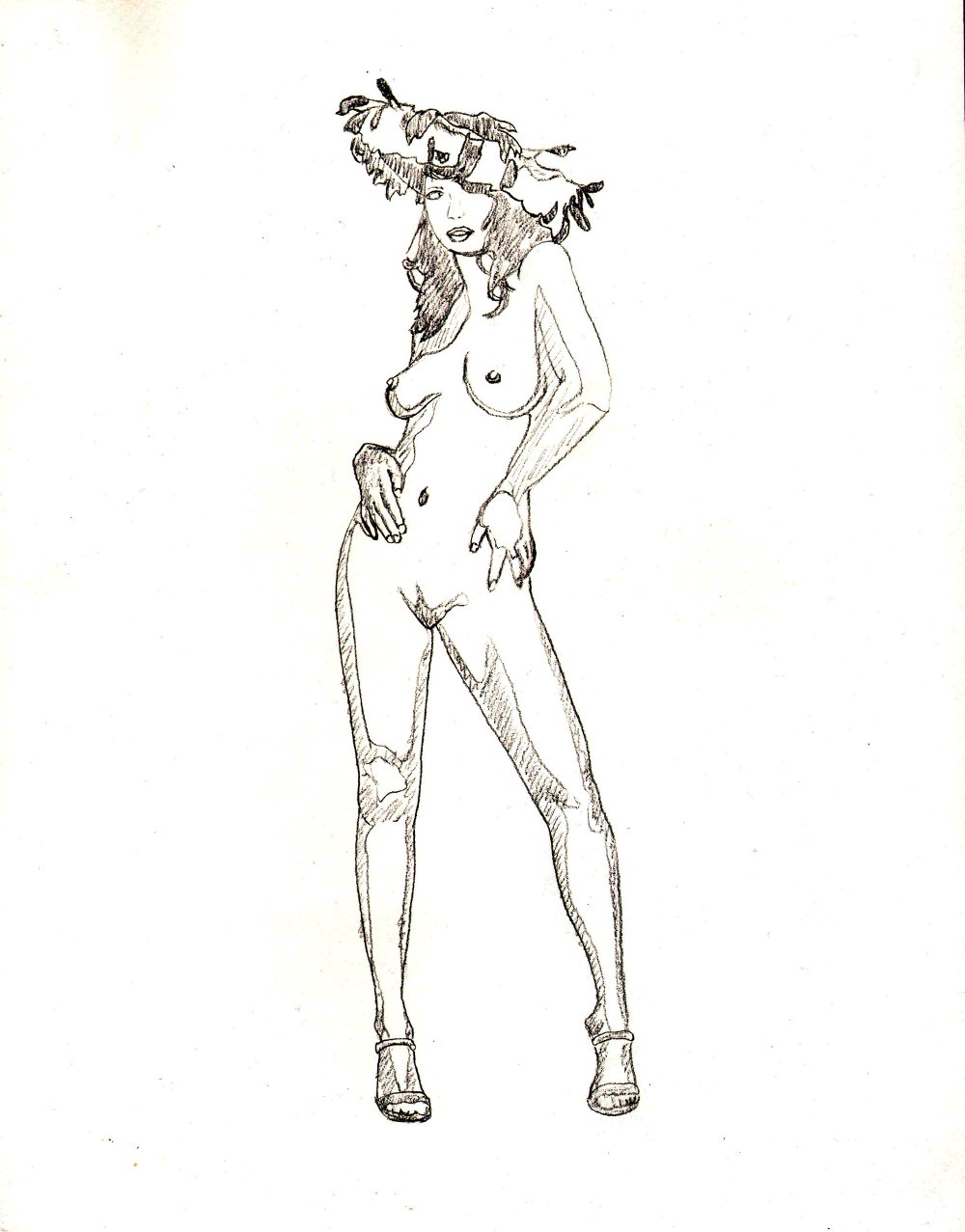
I have started this new image without any planning...yep, didn't I learn from last time. But! I think one of the most important things about drawing and when you are in the mood you just need to go with it, and after life drawing tonight I was in that mood. Here I grabbed a sheet of recycled card stock and the col-erase (as it was to hand on my desk), and started drawing a great reference that I have been looking forward to working on for a while. The recycled paper has a more tooth than the normal fine paper that I use and the col-erase leaves a mark with a very gentle touch so erasing is much easier, and with a plastic eraser seems to have little impact. Well here is the first step, I hope I can keep the feel of this when I carry on.


Sunday 19 December 2010
Hitting the tone
Well today I have been experimenting with tone. For this I drew Lexxii using a light box and a col-erase pencil. I didn't draw any lines, and tried just to draw with cross hatching and shading. It was difficult and I have learned to appreciate how useful line is in setting up an image even if the line is removed, or mostly removed during the rendering phase as I normally do. I enjoyed this and am happy with the outcome for a quick sketch.


Behind you!
I am now finished with this image. I have learned a few things from it, such as how much fine motor control is needed for fine cross hatching and drawing with the mechanical pencil. I like the way the contrast on the dress has turned out, which is different to the reference.


Saturday 18 December 2010
Hand aches now
I have got to the first stage draft of this now and my hand really aches. Maybe I should have rested more, but I wanted to get this done. I am more comfortable with this now and think the main difficulty so far has been the amount of detail in the dress, though I really like the contrast and effect it has. I will carry on and darken the skin tones tomorrow...well later today when I get up again.


The Sharp Bluntness of it
Still working, but I don't think this technique is for me. The mechanical pencil has its add disadvantages. It does keep a point, but the sharpness of the point seems to vary. As one side of the 0.5mm point wears down it does get blunt until you turn the pencil a bit and then it is really sharp again. I don't get this with the clutch pencils or the col-erase. Also the micro small lines are hurting my hands and forearm a bit to keep up. I will still try to finish this though, but I don't think I have the patience to try so hard for the realistic effects. I have enjoyed drawing the hair the most, so far.


Thursday 16 December 2010
Raising Hair
Last night and this morning I have been working on the hair in this drawing. I have also been using a 2B mechanical pencil. I am not used to drawing with this type of pencil and have not found it comfortable in the past, but I have been reading about how they are good for keeping a point when drawing in fine detail, so I am giving it a try.
This is not a great scan as I don't want to take the paper off the drawing board again.

This is not a great scan as I don't want to take the paper off the drawing board again.

Light it up
In an attempt to try some other rendering techniques I have started this project with a spot of light boxing. I have used the grid method too in the past, but the light box seems faster. A big problem with the light box method though is that it requires an image of the final size (here I am using A3). I have an A4 laser printer and an A2 wide format printer, but the high contract B&W laser printer worked out best here after adjusting the reference for high contrast. I them cut the A3 image in half and printed it as two A4's which I then taped together.
A down side to light boxing however is that it doesn't do much to help your free hand drawing skills. Anyway here is the first rough outline.

A down side to light boxing however is that it doesn't do much to help your free hand drawing skills. Anyway here is the first rough outline.

Tuesday 14 December 2010
Par-Boiled
Well I didn't plan this one and just went with the flow, and the flow went down the drain. This drawing has at least given me a better feel for the reference and helped to highlight some areas to take care with when doing a proper drawing :)


Monday 13 December 2010
Project Planning
I was starting a new project today, but haven't had much planning time. I have started here with a simple line drawing and am now exploring a look for it. So far I am not sure if I will complete this image or keep it as a planning sketch, which is something I haven't done before.


Getting over it
I have a great weekend at Butlins, and now I am trying to get over the lack of sleep. Life drawing again tonight, which did suffer from lack of concentration. It is also cold here now and our poor model did suffer and eventually needed to put some clothes back on, but I did get this quick sketch beforehand.


Friday 10 December 2010
Quick Sketch
I am away for the weekend so I don't want to start a project till I get back. So in preparation I have done a quick sketch of one of the images I may work with.


Wednesday 8 December 2010
There now, for now
OK, I have drawn a line under this picture...well for now at least. I have added more tone around and especially round the face. Here is the reference for the picture Blue coat.
I will try the fixative tooth effect with anther sketch, and if successful may eventually come back to this one.

I will try the fixative tooth effect with anther sketch, and if successful may eventually come back to this one.

Getting Precious
I started this picture with the intention of doing a quick drawing to test the use of fixative to add tooth back to the working surface, after having worked on it for a while. The aim being to get better darks with the prisma col-erase pencil. However four day later I am still working on this image and starting to get a bit precious about it. I am no longer sure if I will use the fixative layers technique on this, though it does need a bit more work on the hair which is in danger to becoming cover rendered if I have to keep working the darks in there in the usual way.


Tuesday 7 December 2010
Diving in to Pop it out
So most of the block tone is in place now, but it still needs balancing and the contract needs to increase to make the image pop a bit. The middle of the hair needs to be darker and the shirt edges need more contrast to bring them away from the skin. The buttons are popping out a bit too much and the tone around them needs to go darker to reduce the contrast a bit.


Round the houses
Now I am relaxing in to blocking the tone in. I have been really enjoying this stage so far, though I can see where I need to go back and balance the tone as there are lots of darks missing, but I have a plan for them. I will aim to use a layer of fixative to gain more tooth later.


Monday 6 December 2010
The Wrong Hands
Well last night was life drawing night again, with our local beauty. This model often poses with a large cloth, which provides variety and a change of textures. Unfortunately I didn't have my drawing hands on and the best I managed was a few small sketches.


Sunday 5 December 2010
Back on the Hot Press
Yes I am back on the hot press paper again. The smooth finish gives so much more control, and I will worry about getting the dark darks later. This is a full length A3 drawing, which is the most awkward large size paper I can manage on my desk, the danger is that it will get badly smudged while I work, so I need to use a protective sheet.
This image is extra challenging, as although it was submitted as a drawing reference, it has a large water mark across the middle of it which comes out really strong if I print the picture, and I am trying to work around it.

This image is extra challenging, as although it was submitted as a drawing reference, it has a large water mark across the middle of it which comes out really strong if I print the picture, and I am trying to work around it.


Saturday 4 December 2010
Directions
OK, I have done more of the main figure rendering and I am not too comfortable with the way this is going. I am having some trouble getting the range of tone I need and the details are getting lost with this paper. Often the drawings can look a bit rough at this stage, but I must admit I am having my doubts with this one now...
... I have now decided that this image just isn't going to make it, so I will stop here and put it into storage. The lesson to take from this is not to try and get lots of details with this bamboo paper. It works well for large images and textured or toned areas, but not for fine detail or controlled tone gradients.

... I have now decided that this image just isn't going to make it, so I will stop here and put it into storage. The lesson to take from this is not to try and get lots of details with this bamboo paper. It works well for large images and textured or toned areas, but not for fine detail or controlled tone gradients.

Friday 3 December 2010
Light at the Back
This time I have decided that I don't want the background to be so dark, so that I can keep the contrast in the foreground. To make this a bit easier I am trying to lay in the mid background tones first, as I will be able to lift them out more easily as I work, or lay down some sharp dark tone next to them. This paper allows for quite a bit of working, but it is difficult to add a sharp light edge later on.


Thursday 2 December 2010
On the line
I have really enjoyed this project so far. The basic line work and block areas are marked out using my B carbon clutch pencil. I will try to put in at least some basic background references before rendering, as I think that will make it easier to maintain later with this bamboo paper.


Wednesday 1 December 2010
Bag of Bits
Ready to start a new project again. I will follow the same process as the last one as I think it lead to an interesting result and I enjoyed it. The first stage of putting the images together seems to take a while though. I have been pasting things together in GIMP but it can be hard to tell if they will work from the photos. I think I will collect more reference images to start with then just dive in.


Tuesday 30 November 2010
Power Dressing
OK I have only made a few minor changes to the image in the end. I was going to erase a space at the bottom for a signature, but the graphite is just too thick, I would need to scrape it off and risk damaging the paper.
Re-scanned now, and the grain of the paper seems quite clear in this one.

Re-scanned now, and the grain of the paper seems quite clear in this one.

Back to black
Now I've gone and done it. I started to add a soft background but the texture of the paper meant that I lost the line of the figure, so I needed to go really dark in the end to bring it back. In an earlier post I said that I was using the Progresso pencils but in the end I really used the B/2B carbon clutch pencils for most of the drawing, but I did do the background with the 4B and 8B Progresso. They seem to give a good dark on this bamboo paper.
I will leave this image to mature for a little while now so that I can come back and finish it with a fresh eye. Though I am not sure at this stage what else I will be able to do as I have committed with so much dark? Well I guess if nothing else changes it still needs cropping and balancing properly as the light area round the legs seems to be a result of the scanner light on the graphite layer.

I will leave this image to mature for a little while now so that I can come back and finish it with a fresh eye. Though I am not sure at this stage what else I will be able to do as I have committed with so much dark? Well I guess if nothing else changes it still needs cropping and balancing properly as the light area round the legs seems to be a result of the scanner light on the graphite layer.

Monday 29 November 2010
I have the basic rendering of the body down now, and it is time to think about the background. As there is quite a contrast gradient in the image I will have a lock for a graded background reference, but I expect I will go for a graded tone. I am pretty please with how this has turned out, though some of the detail does seem to get lost in the soft edges produced by tooth of the paper. I chose this paper partly to give a softer finish so I shouldn't be surprised.


Cold winter night
Last night was life drawing night again, and it was cold. The snow came down really fast just before the start and we were thin on numbers this week. As you may be able to see from the post our model needed to wrap up a bit. I don't feel like I did so well with the tones this week especially with on the cloth, even though I did have the time. I guess that is the challenge of life drawing, you just need to do what you can on the day.


Sunday 28 November 2010
Top down
I am really enjoying the rendering of this image now. Due to the tendency to smudge quite a bit I need to be strict about working away from my hand, so I am working from top down left to right. All apart from the background, which I will leave to near the end to try and balance some of the tone.


Adding the extras
OK, back from a birthday party weekend and now I have added some more details to the image. I had forgotten how much graphite can smudge on this paper so I have also moved back to my B clutch pencil to finish up the line work.
It has been difficult to keep the details clear with the paper at this size. Looking back at my other pictures on this paper they have had less detail at this stage so I will just need to see how this progresses.

It has been difficult to keep the details clear with the paper at this size. Looking back at my other pictures on this paper they have had less detail at this stage so I will just need to see how this progresses.

Saturday 27 November 2010
Fig. 1
I have now got pencil to paper, at last, on the new project. This time I am working on bamboo paper which has quite a bit of tooth, but is also hard to scan due to the texture. It is unusual paper to work with as it can take a lot of erasing while holding together really well, but at the same time is quite fragile. I need to take care not to bend the corners or dent the surface of the paper. With this paper I also like to use soft Progresso graphite pencils, which come as graphite sticks.
Again I am using one of Veronika's reference images.

Again I am using one of Veronika's reference images.
Thursday 25 November 2010
The Best Plans
Well my next project is taking quiet a bit of planning. I normally see an image I like and dive straight in, but this time it is taking quite a while to get the right image of the right quality and resolution. I plan on combining a few images together and need to make sure I can remove surrounding context from the individual parts so that I can see how they will all fit, but a lot of the figures I would like to include seem to merge in to the background. Hopefully I will get the pencil going again some time today.
Tuesday 23 November 2010
Inky
I have also done a bush inking of the last image. My brushes seem to be wearing out a bit now, and I can't decide what type to go for next? Maybe I will stick with the PITT pens for a while or just graphite?


Darker and down
Well I carried on working with the col-erase pencil but it was increasingly difficult to get the darks that the image needed and the rendering started to get that over-worked look so I needed to add some more line. Then I added some darks with the prisma color black pencil. This pencil does not produce as even a line as the col-erase though it is much darker so I needed to work with both pencils for a while and also with the electric eraser.
In the end I am now happy with the darks but will probably look at working with the darker graphite pencils on paper with more tooth next time, and probably stick to graphite instead of the prisma colors for a while. The prisma color pencils do have a really good feel when being used but I find they can be difficult to finish a drawing with.
I should also say that the reference for this image came from Kevin.

Monday 22 November 2010
Living it up night

In the shade
I am now back from a weekend at Erotica and am trying to get back into the swing of things. I have started to add more block shade to the skin tones and the cloth. Next, adding more tone and starting to fix some of the errors I can start to see more clearly now that there is a bit more shape to the figure. It seems a bit strange making these basic changes at such a late stage, but it is all part of needing to get some of the shade in early I think. Good job I have kept the pencil quite light so far.
I will need to clean that scanner plate too...

I will need to clean that scanner plate too...

Thursday 18 November 2010
Line and Block
This is the start of my next piece. There is a lot of soft shade in the reference image so I have started with a mixture of line and block shading. This is not how I would normally start a drawing so it will be interesting to see how this one works out. There is a bit more detail in the face at the early stage too he to try and get a feel for how the light will fall on the part of the face that is exposed.
Last post for a while now as I am off to Erotica today...

Last post for a while now as I am off to Erotica today...

Wednesday 17 November 2010
To the gallery
Well I have submitted some images to an on-line gallery. It has taken a lot more time and effort than I had expected putting it all together. Just have to wait and see now if they are accepted...
Tuesday 16 November 2010
The Last Pose
I liked last weeks sketch so I have inked that too. I may try some smaller sketches next with a better indication of light and shade to make them easier to ink, but it never seems that easy when the model is there in front of you in full 3D...Maybe I could even get some good sketches at Erotica this weekend?


Monday 15 November 2010

Sleepy Monday
Yep, Monday is life drawing night again. Sometimes I find that being a little tired at the end of the day helps me relax and draw, which can help me get into the zone. This week I was a bit too tired to finish as much of the images as I would have like, but I had a good time all the same. The contrast on this scan is really high as it was a pretty light drawing.


Sunday 14 November 2010
Self-Reflection
Now she is finished.
I have enhanced the contrast in the image a little more, though this is hard to see from the posted scans as I have adjusted the contrast digitally on the other images so that they can be seen better. Also I have only added a soft background as there was the danger it was making the image look a bit too soft at the edges.
I have enjoyed this drawing and the reference puts me in mind of a woman alone in a bedroom, checking out her reflection in the mirror after getting up.

Saturday 13 November 2010
Foreground darks
I have added darks to the foreground image now, and you can see that the image has more contrast and the background is much lighter from the scan. There is also more depth to the figure and I will start adding some background next.
I usually find it takes a while to decide on the background shading, but I do now find that I like the look of light hatching in the background and around the figure to contrast with the smother feel of the skin.

I usually find it takes a while to decide on the background shading, but I do now find that I like the look of light hatching in the background and around the figure to contrast with the smother feel of the skin.

Friday 12 November 2010
Working in the pencil
Now I have spent some time blocking off the darker tones and starting to add some depth. I may leave the cloth quite loose in the final image so I am using some clear hatching there. Next I need to spend some more time working those darks with this pencil. The col-erase feels soft to work with like a darker 2-4B pencil, but has a much softer shade like a H, but like a softer pencil the shades can be built up with application.
I am glad I scanned the early images as when I looked back I was starting to loose some of the pose that I liked from the original lines so I was able to pull that back. I also seem to have a bit of dirt on the scanner which I will need to clean up for the final scans.
The scanner I am using is an A3 Mustek 1200. It was the cheapest one I could get and doesn't yet seem to have native Linux drivers, but is by far the best digital art equipment I have invested in.

Early shades
I have started on my next piece. This is almost the first stage, as the first lines didn't seem to get picked up by the scanner. I am drawing this one freehand (as usual) with a col-erase black pencil. The pencil is really smooth to work with, but is not good for getting dark dark's, but I'm not there yet. I got the pencil tip from http://www.drawing-tutorials-online.com which I found to be a really useful site.
Here I started the line drawing on my angled drawing board to help reduce perspective errors, then took it of the angled board to scan it and carry on shading on a flatter board that is less cumbersome to use and allows me to rotate the paper more.
The image here is dark as the pencil is still really light. I start shading the dark areas first, but only lightly so as to allow for corrections.

Thursday 11 November 2010
What's the Mat-er?
I finally invested in a Mat cutter and rule. I have tried to use one before, so I knew it wouldn't be easy. I got a DAFA cutter off e-bay and 5 boards. I thought that I would loose most of the boards practicing and hoped to get at least one cut Mat out of them.
Well it didn't go to plan. I used all 5 boards but have nothing to show for it, but I did learn a few things along the way...
The cutter was cheap, and I think I would have been better off spending a bit more on a recognised brand. When running the cutter along the paper, the sharp edges on the cutter's body caught, lifted and ripped the already-cut edges of the board. As I was cutting from the back, this meant that the sharp bevel edge was ruined.
I used the cutter on a board of MDF covered with a few sheets (~10) of drawing paper. The surface seemed fine, though I think an investment in a larger A3/A2 self healing mat would be worth while. I later tried cutting on top of some off cuts of the Mat board, which seemed to turn out better.
The main problem with the cutting was that the cutter would often tear the board and produce a lot of dust.
In the end I just ordered a few ready cut boards from e-bay, from a seller I have used a few times with good results and at a cost of about 20p more per sheet than the un-cut boards were.
The next morning, not wanting to give up I tried again with a different blade, to find I got some nice sharp bevel cuts using the board scraps I had left over. This was a shock as the cutter was new and I expected that the fitted blades were sharp but it appears they weren't.
So with my new small experience I plan to try again on some new boards with a sharp blade...
On balance, I think being able to cut your own Mat boards is a convenience when you need a non-standard size and can't wait or don't want to pay a disproportionate delivery fee for a single board. Now I have invested in the cutter I will try my best to get it working, but I won't be rushing out to buy replacements when these blades run out or I need a new cutter.
Tuesday 9 November 2010
Life Monday
Monday night is life drawing night, and I had a good night. Some of the poses were a bit shorter than I would have liked though so I didn't get enough time to lay down the darks. As a result this image was really difficult to scan, but great fun to draw!


Soft Inking
I have now inked 'The Cat and The Bird' with Pitt pens. I do like brush inking but have found the pens to be more practical for some images. Here is the raw inked version:
While I enjoy the original inked images, I also like the extra depth that can be added to a simple monochrome drawing with a simple digital effect:
The soft blur is very subtle and may not be visible in this smaller image post.
 |
| The Cat and The Bird (Ink) |
 |
| The Cat and The Bird (Soft ink) |
The soft blur is very subtle and may not be visible in this smaller image post.
Subscribe to:
Posts (Atom)