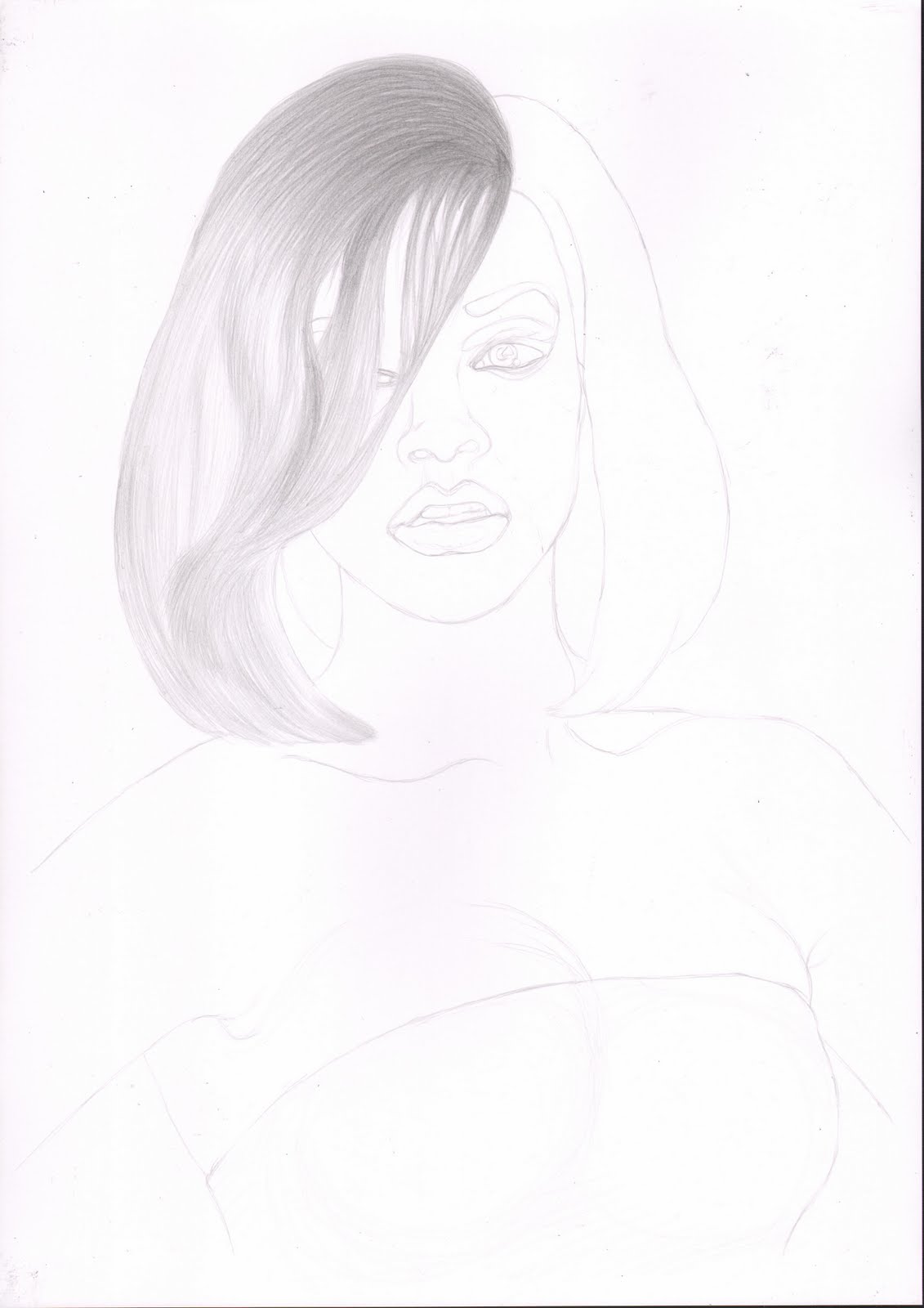
Wednesday, 13 July 2011

Slowly Undo It

Just a bit more...


A tame image for the front page of my new web site http://slowly.undo.it


As usual I started with the easy grid method.


I felt the ruffles on the top were a key detail feature of this image and were needed to set the tones of the image so I started with them.


Next I added some darker tones to add turning plains, and a border to contain the top on the left side.


For balance I added the opposite next, and aimed for slightly darker tones as the model's arm is turned away on this side.


The sleeves of this top were a little lighter than the main body. I added the key darker areas first to define the shape of the material.


Continuing I then completed the tone for the rest of the sleeve.


Once the top was blocked out I added the bra where the main contrast is in this image.


Then the shade tones were added to give shape to the breasts. These were a balance between darker tones to show shape and keeping the contrast with the bra. Also the skin near the bra was kept light as the curve of the breasts were reflecting the light.


The hands were added with light tones as they were near the level of the light and the edges held the most contrast as they case slight shadows.


Multiple slight passes were then made over the whole image to enhance edges and turning plains.

Tuesday, 5 July 2011

Pull

A study of simple plains.


Using col-erase pencil again, looking at simple turning plains over a larger area. This image has grown on me more since finishing it.


As usual started with the easy grid method.


I started with the background on this one. I wanted it to be quite dark and it would take a lot of working over, and I didn't want to be leaning on the main image to do the background.


Working from dark to light this time I started with the arm in shade. The hand took some time to do working on the turning plains, slowly increasing the contrast.


Next I worked on the other arm to balance the image and keep the relative tonal values. I didn't take a scan here, but the tone was added to the main body at a later stage.


Continuing with the body I added some darker tones to enhance the turning plains.


Finally I added tone to the ribbon. I was tempted to make the ribbon black, but I didn't want it to get lost in the background and the light in the reference didn't look like it would work with darker tones.

Wednesday, 29 June 2011

Billie

He who pays the piper...


After watching 'Secret Diary of a Call Girl' I felt like drawing this image. In this project I used carbon and graphite pencils, which I found to be really soft after using the col-erase.


As usual I started with the easy grid method.

As the pencil was soft I started with the hair so as not to smudge the image if I did the hair at the end.


The blond hair was difficult to draw, and over the course of this project I returned to the hair a few times to darken the shade tones.

Next as the eyes and Billie's signature mouth are so important I wanted to get them in place early. The eyes too were often adjusted over the process of this project. I broke some of the portrait rules here and outlined the the teeth as they are so significant here.

Next I added the shade tones round the nose, which I often find leads to the rest of the face tones.


The basic skin tones of the face and chest were added, though the tones were darkened later.


Shade tones were then added to the rest of the body and the top. Also some darker tones were added generally over the image.


Again the tones were adjusted after a break, and the eyes were re-shaped to fit the face better.


Then there was a final pass over the tones. In this project, the carbon and graphite pencils didn't seem to take working as well as the col-erase normally does. But a good draw.

Monday, 20 June 2011

All-in

Poker stakes...


A fun image with large tone areas.


As usual I started this image with the easy grid method.


As the hair was a prominent part of this image, I started to render it from background to front to keep the movement in the hair till last. Also I was treating the male figure mainly as background and a tone reference.


Finishing the first pass of the male figure and trying to get a good tone contract for the facial skin tones and lips.


As usual with the main part of the image I tried to pick out the darker tones so they would not get lost when building up the rest of the image.


First pass of the facial tones, again concentrating on the darker areas.


Added the lips which are a key part of this image, and the start of the hair.


The rest of the hair was added to get the movement and detail, but with a light tone.


Made another pass of the whole image, concentrating on the darker planes and shaded areas, and providing contrast for the reflected light on the models skin.


Finally adding darker tone again to selected areas, such as eye lashes and shadowed hair.

Sunday, 12 June 2011

Holes


This project was a learning experience. I think the main things I learnt were not to choose reference images with too much pattern detail if I wasn't going to draw the patterns, and to avoid drawing fine details from a poor quality reference.


As usual I started with the easy grid method. I also combined two images to complete the top of the upper figures head and legs.


Following the first stage I wasn't sure about some of the line work so I started with the face as I expected it to be the most difficult and telling if it was going badly.


The first face seemed to go well, so I added the hair to frame the face.

Then I added the end of the top models legs and her top. With the top I dropped all the pattern details as they did not allow for much tonal variation. I think as a result the tone of the top came out a bit light for the image.


Then carrying on with the detail I added the gloves, shorts and fingers. This was a dense area of detail and by the end I was again not sure that too much detail had been lost from the reference.


Then to finish the top model, the rest of the skin tones were added.


The foreground figure was added starting from the edges where the two figures overlapped. The dark glove in the foreground needed some adjustment to as not to become a continuation of the line of the first figures leg.

 Some of the dark tones were enhanced with the Prismacolor non-erasable black pencil, which was a good thing to learn, and also I darkened the tones overall.

Tuesday, 7 June 2011

Rihanna

What's her name ...


Well you have to do at least one famous person some time. Now I look at this scan I probably should have cleaned the scanner glass a bit first!


Well I started this one with the easy grid method as you can see.


Then I started with the dark areas of the hair on one side.


I then carried on to darken the hair. This was quite difficult as her hair was colored and straightened, which meant it didn't flow very well and had a strange texture.


Once the hair on the left was done, it was easier to match the other side, which was also less complex.


With the addition of the eyes, the portrait started to come together. The make-up here was quite stylised and pronounced which was fun to draw.


I enjoy drawing the lips as you can really go for the shine without the extra detail that is needed for the eyes.


Next I started to add tone to the nose, but this naturally lead to shading the rest of the face, so I just went with the flow on this.


I started next on the body and shade round the lower jaw. As I wanted to keep this large area consistent I worked on it all at the same time, but started with the darkest areas.


Finally I added some clothes.