Thursday, 21 April 2011

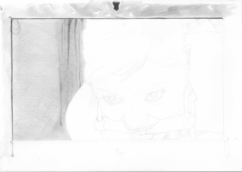
Through the Hatch

Take a peep inside...

This was a really relaxing draw. Col-erase on 220 gsm Bristol board.


As before I started with the easy grid method.

Working top left to bottom right, I started with the hatch border. It was a little strange starting drawing from the immediate foregound, but as this was a border with a dark edge it worked out fine. I also started on some of the darker background here too.


Though tempted to move on to the main figure I put in the left side background here. I left the looser cross hatching to give a rough gain effect.


Next staring on with the hair. It is slow going but gives a satisfying finish. I left it a bit light here to come back later with some darker tones.

Finishing off the hair frames the space for the face nicely.

 So as not to loose the facial features when I start adding the face skin tone the eyes and brows were added. There was a nice light reflection I wanted to catch here. The eyes were also made a bit darker than in the ref.

Starting on the left I added the darker skin tones and again made them darker than in the ref to give more shape. At this stage the edge of the face was not well defined.

I then added some more background to mark out where the edge of the figures body is places as it is mainly well lit.

I really liked the effect of adding the gag bar, as it brought contrast to the image and helped to define the contours of the face.

Adding the loops to the gag bar provided the final definition for the sides of the face.


Finally I finished the border for the hatch and darkened the tone across the image.

Friday, 8 April 2011

On the Rim

The result of a slow draw...


Another project using col-erase and Bristol board.


As normal I started this project with the easy grid method.


I started adding tone with the hair in the upper left corner. This allowed me to avoid resting my hand on the drawing. Also the hair had some of the darkest tones and so helped to set the range of tones early.


Taking the hair in sections I then continued to build it up keeping the pencil strokes aligned. I also tried to blend the boundary where the hair thins towards the face. There is also a shaded area here so getting the balance right took a few attempts later as more of the hair is added.


The stands of hair were also added, but in smaller sections.


The latex top took a lot of work. I completed this in sections. The sections were chosen from the sections of latex as they would have been glued from. This helped to give areas of consistent tone but in small manageable stages.


The back and shoulder was added, built up from layers of cross hatched pencil and then blended with a circular motion. I enjoyed building this up as it really had a three dimensional fell.


I then added the pale seam and completed the visible upper sleeve, and the hoop detail on the front. I also added the earring as it is in the foreground and was built up in the same was as the metal loop.

To consolidate the skin on the first figure I added the shadow tones from the hair, followed by the lighter skin tone layers.


Leaving the first figure, the back and top strap of the second figure was started. Again I was working top down here to avoid resting on the image, and also trying to show the line of the first figures face using the shadow tones on the back.

To complete the top of the image and to set the tone of the lighter latex material I added tone to the arm and waist band.

The bum area didn't have much tone variation and covered a large area of the images so I started to break  it down with soft shadow tones.

The skin tones were built up in layers with the dark tone near the thumb proving a dark reference tone. The shadows caused by the clutching hands were also added carefully to avoid harsh edges.


A final pass over the whole image was make to enhance the darker tones.

Sunday, 27 March 2011

Coffee Table


Just casual on the Coffee Table...


This project was done with Col-erase on Bristol board.


As before I started with the easy grid method.


I chose to start with the figure with this one, though later I thought it may have been better to start with the background. Again working left to right to avoid leaning on the picture.


Working up the body I decided to mark the ropes with a strong tone round the edges to make them clear.


I then did each leg a a single large area as there was little tone variation.


The rope on the legs as defined the same as the rope on the upper body.


Working along the shaded area under the figure I added the rest of the hair, the arms and the tone on the lower ropes.


With the col-erase pencil adding the dark tone for the shoes took a lot of work, and the highlights were needed for the contrast.


Like the shoes, the pole took quite a bit of shading, but with less contrast as the end was a soft rubber with less highlights.


Adding the coffee table took some time and I needed to change the areas I was working on to give some variation of tone.


Finally the leather sofa was added with a soft background tone and more darker tones were added to the figure.


OK, after scanning, balancing and uploading the image I decided that the wide view grain on the table didn't look right. The angle doesn't look so extreme on paper but I decided I needed to change it still.


Saturday, 19 March 2011

To rise again

I wanted to draw another image of Veronika which led to this images. I also needed a background for her to be tied to, as part of the fixings were missing in the reference image, so I chose something related to the coming holidays.


This was done with Prisma color col-erase black and Bristol Board.

As usual I started with the easy grid method and some line work you probably can't see :)


I started this picture just before going away for the weekend. As I didn't want to break my flow for the main image I started with the background. Also working top to bottom, left to right the top of the cross made a good place to start. I really enjoyed doing the wood texture with this pencil as I could work it up slowly.


Once I completed the top of the cross it made sense to do the other two arms and the small vertical that could be seen to provide something to render into.

Moving on to the hair was difficult as the reference was a composite image and the tone of the hair was close to that of the wood. I needed to add some shade to the wood to differentiate the hair a bit.


My difficulties started here with the face. I added the features early as I normally do this to avoid loosing the details as the skin is rendered. However with this image the face was in largely in shadow so the facial features seemed too strong at this stage.


After adding more tone to the face I lightened it all again and decided to added the shadow on the arm and come back to the tones of the face later.


Moving on the breasts and the ropes provided more opportunity to work on the shadow tones and try to work out how the shadows on the face would work.


I worked on the sections of skin between the rope in the same way you color abstract scribbles at school. The upper led and waist area again provided an opportunity to work with darker shadow tones.


I then went on to add the shadow tones round the legs and started to darken the facial tones again.


Finally I decided that the shadows on the face were really quite dark in the reference and were about equal to those on the arm. So I went of there whole image a few times and darkened shadows and boundaries. 

I was torn in this image between keeping the dark shadow tones from the reference and making the facial features more prominent. At the end I am not sure quite how I feel about this one, and I make come back to work on it again in the future.


So I now have had another go and re-established the shape of the eyes.